
The Overview report is a summary of how your site is converting. It shows your conversions, the value behind them, where your visitors came from, and which pages brought them in, all for whatever date range you choose. It also compares that range against the period just before it, so you can see whether things are getting better or worse.
Finding the Report
Go to Settings → Conversion Bridge → Reports & Tools. Overview is the first item, and it's what you land on by default.
Choosing a Date Range
The date picker at the top controls everything on the page. It starts on the last 30 days.
You can pick one of the ready-made ranges — Today, Yesterday, Last 7 days, Last 30 days, Last 90 days, This month, Last month, Year to date, or Last 12 months — or choose your own start and end dates on the calendar and click Apply.
Next to it, the Conversion Event Type dropdown narrows the whole report to a single kind of conversion, like purchases or form submissions. Leave it on All Conversions to see everything. Click Apply Filters when you've made your choices, or Reset to clear them.
The report is saved for 15 minutes so it loads quickly. If you have just tested a conversion and want to see it straight away, add ?refresh=1 to the page URL.
The Numbers at the Top
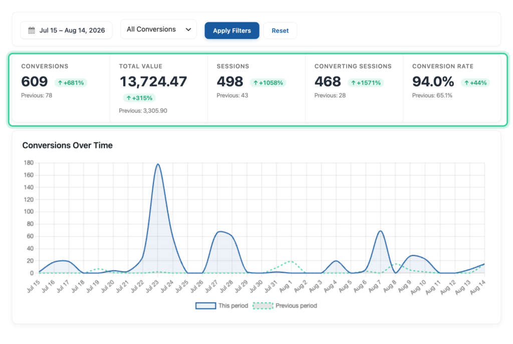
Five cards summarize the range you picked.
- Conversions — how many conversions happened
- Total Value — the money behind them
- Sessions — how many visits your site had
- Converting Sessions — how many of those visits ended in a conversion
- Conversion RateImproves website performance by increasing the percentage of visitors who complete desired actions, such as purchases, sign-ups, or form submissions. — the share of visits that converted
Under each number is the same figure for the period before, plus an arrow showing whether it went up or down and by how much.
The comparison period is always the same length as the one you picked, ending the day before it starts. So if you're looking at the last 30 days, it compares against the 30 days before that. Same length, so the comparison is fair.
A couple of the labels are worth knowing. New means you had none before and some now, so there is no percentage to work out. A dash means there was nothing in either period.
Charts and Tables
Conversions Over Time plots your conversions day by day, with the previous period behind it as a dashed line so you can see the shape of the change, not just the total.
Conversions by Event Type breaks your conversions down by what they were. The table beside it shows the value of each type and how each one has changed, and you can click any type to see those journeys.
Top Traffic Sources shows which campaigns brought in conversions, compared against the period before. This only counts visits that arrived with campaign tags on the link.
Top Converting Landing Pages shows the pages people arrived on before converting. Not the page they converted on, the one that got them in the door.
Recent Conversions lists the last ten, with the value and when they happened. Click any one to see that visitor's full journey.
Every one of these links through to a fuller report, and your date range and event type come with you, so the numbers still line up.
The Overview uses the same figures as your weekly summary email, so the two will always agree.
If Conversion Journeys Are Off
Sessions, Converting Sessions, Conversion Rate, traffic sources, and landing pages all depend on knowing the first page a visitor landed on. That is recorded by conversion journeys, so with journey tracking turned off those parts of the report have nothing to show and will say so.
Your conversions and their value are still counted and still shown. Turning journey tracking on starts collecting the rest from that point forward.